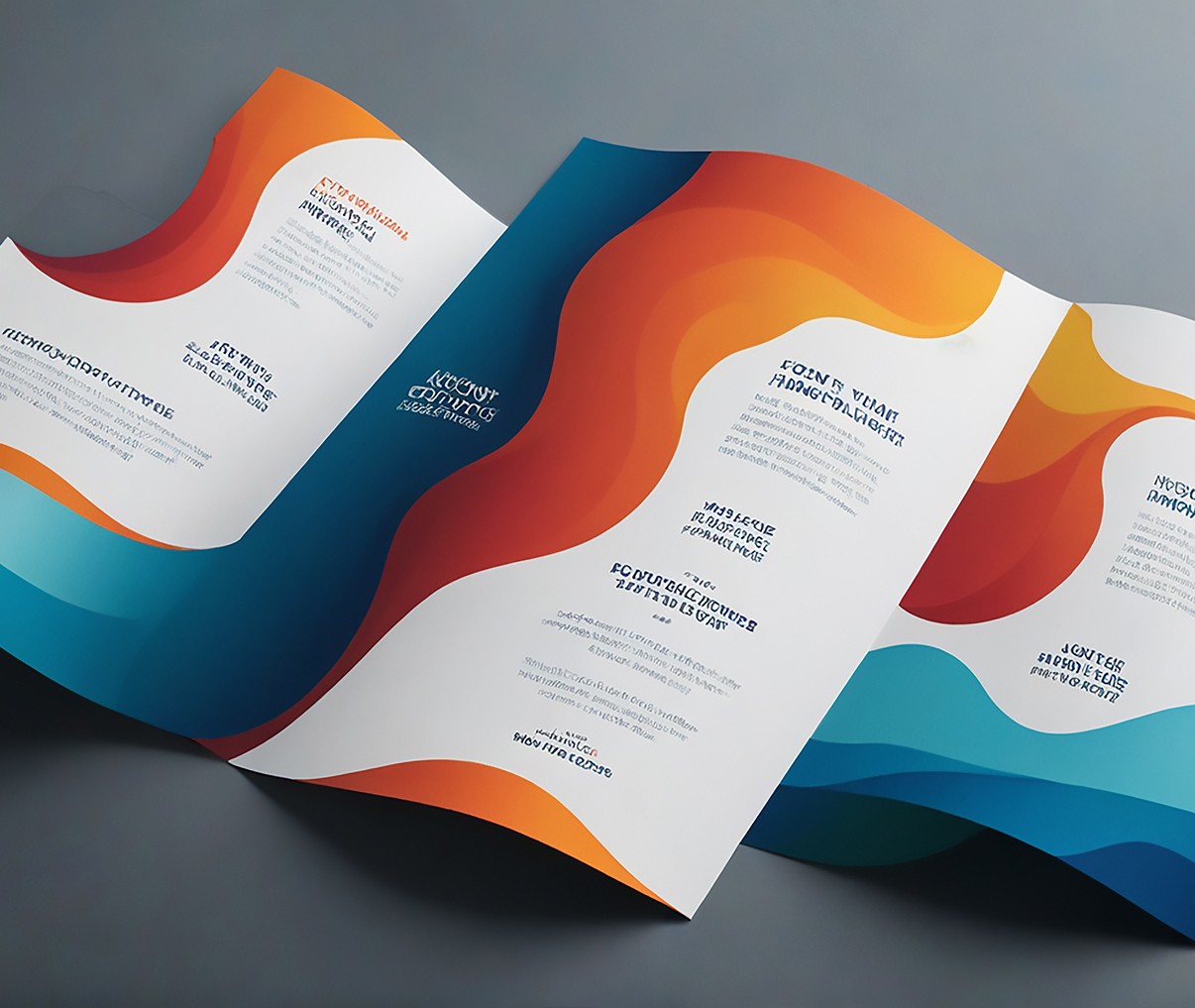
Tips for Creating Engaging Graphics
Nunc turpis at tellus felis leo porta vitae egestas dolor. Risus quam gravida quam aliquet donec tellus amet ac
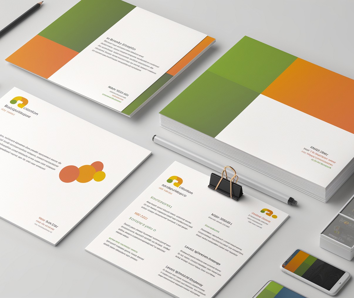
Tips for Creating Engaging Graphics
Nunc turpis at tellus felis leo porta vitae egestas dolor. Risus quam gravida quam aliquet donec tellus amet ac
Summary
In today’s digital environment, visuals carry more weight than ever. A compelling graphic can stop the scroll, clarify a complex idea, or make a brand instantly recognizable. But creating engaging graphics isn’t about throwing trendy elements on a canvas—it’s about intention, clarity, and execution. Whether it’s for social media, a website, or internal comms, smart design grabs attention and delivers results. This post explores the methods and mindset behind graphics that don’t just look good—they perform.
Design With Purpose
Great design starts with clarity. Before picking a font or choosing a color, it’s essential to understand the purpose of the graphic. What action do you want the viewer to take? What message needs to land immediately? Purpose-first design avoids decoration for decoration’s sake and focuses instead on communication.
Every element—text, layout, imagery—should work in service of the graphic’s goal. Without that foundation, even the most beautiful visuals fall flat. When the message is locked in, the design choices become obvious. It’s not about doing more—it’s about doing the right things, intentionally.
Hierarchy and Readability
Once purpose is in place, structure becomes the next priority. Visual hierarchy controls how someone reads and interprets your graphic—what they see first, where their eyes go next, and what they remember. A clear hierarchy simplifies scanning, speeds up comprehension, and increases retention.
Use bolder or larger text to emphasize key points.
Choose font pairings that balance personality with legibility.
Break long copy into smaller, digestible sections.
Let whitespace create rhythm and focus.
Good hierarchy also helps maintain consistency. Headlines should command attention. Supporting text should explain, not overwhelm. Visual elements should lead, not distract. When layout, spacing, and type all work together, the viewer doesn’t have to work hard to get the message.
“If a graphic makes people work to understand it, they won’t. Design should make reading effortless.”
Impact on Performance
Well-designed graphics do more than make things pretty—they drive measurable results. Whether you're tracking clicks, saves, shares, or time on screen, visuals play a huge role in engagement. A strategic layout can increase conversions. A simple, scannable post can get shared twice as often. Clarity creates action.